Squarespace is a website building platform that prides themselves on the beauty and simplicity of their websites. We used the Squarespace free trial period to test out the product. Here’s what we found.
Squarespace vs. Weebly pricing
Squarespace offers users a 14-day free trial. Their pricing for personal pages is steeper than competitor Weebly at $16 per month for the basic plan, and $39 per month for the advanced plan. Weebly’s basic plan is free, and their professional plan is $12 per month.
The business plan pricing also differs across the two platforms: Weebly offers $26 per month business plan pricing and Squarespace offers the same, but it costs $99 per month.
Getting started
To get started with my free trial of Squarespace, I am first directed to the “templates” page. Just like Weebly, Squarespace has ample templates — for non-profits, restaurants, artists, wedding announcements, etc. I chose to start with a design that came from a restaurant, although my (fictitious) business is a hair salon in Menlo Park, CA.
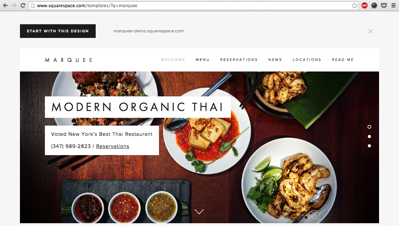
After choosing a template I am prompted to give my basic personal information, i.e. name and email, what my site will be used for, and a title I want to give my site.
Because my site is used for business, I am asked to answer more questions, this time about my business, including hours and location. Now I’m ready to edit my page!
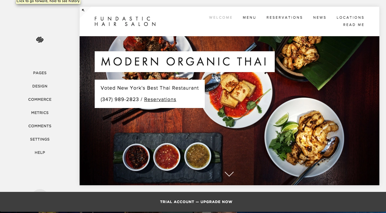
Editing tools and features
The first thing I want to do is edit the text and pictures on my homepage. Squarespace makes editing the title easy — scroll over any part of the title or background image, and a popup menu will allow you to make edits to any part of the page.
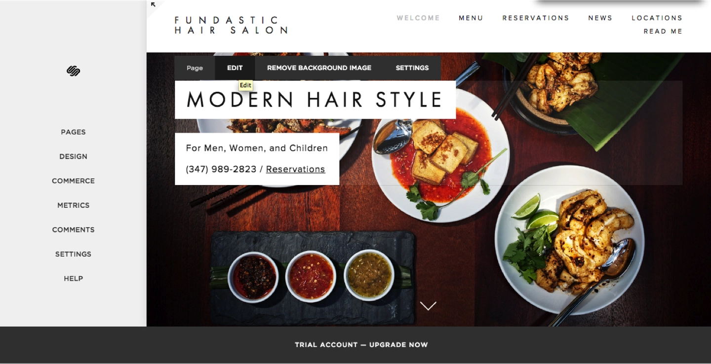
To upload my own background image, I need to remove the existing image, then click to upload my own. The background image that I’m uploading is fixed (meaning other page objects scroll over while the image stays in the same place), so I’m not going to worry much about cropping and editing the picture to fit the header space.

One thing I love about Squarespace is that the preview of my webpage resizes with the browser. This means that I can see what the mobile version of my website looks like just by shortening the width of my browser.

I noticed that the left corner contains the name of my business, but I’d like it to display my logo. I can upload a logo and edit the logo (like any other picture) within Squarespace.
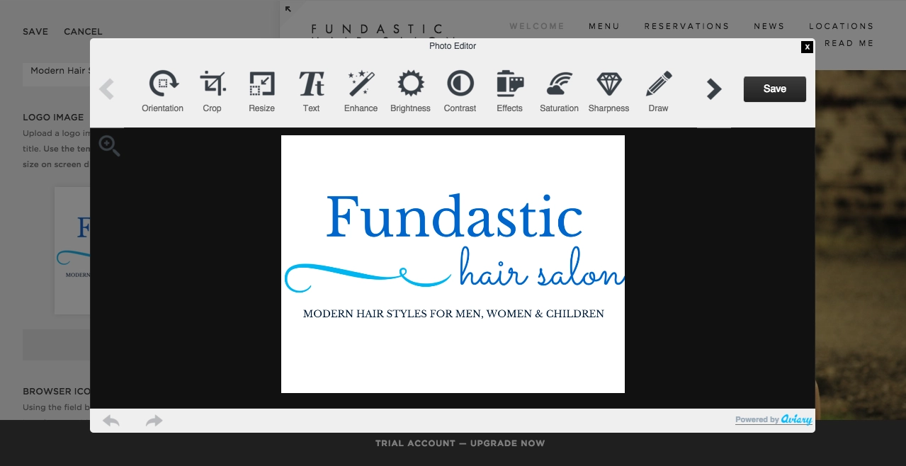
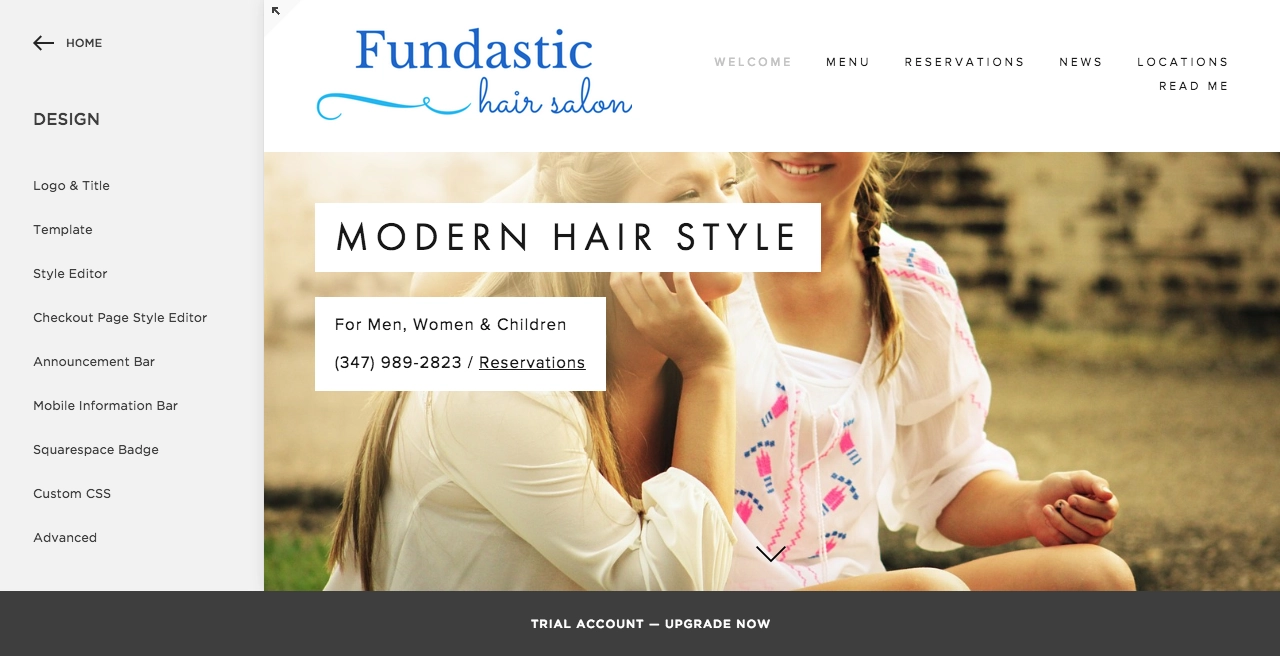
You can tell from the sidebar that I have alot of options to play around with — I can create custom code, add extra menu bars, etc. I can change my template at any time.
After my homepage looks the way I want, I need to make sure I have all the pages that my website visitors want to see. For the template I selected, each of my pages also has subpages. If I scroll down my homepage, I will see the other subpages — for example, the homepage contains 3 subpages, as you can see on the left-side navigation.
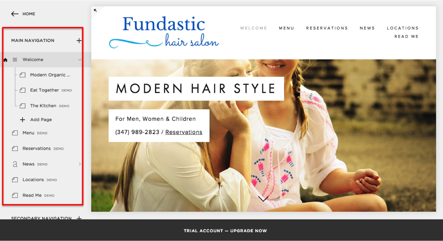
I narrowed it down to 3 pages that I will need: the homepage (with subpages), a Services page, and a page for my Location + Hours.
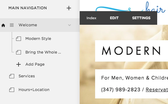
To edit content blocks on each of these pages is a bit confusing. I have to hover over the page until I see a small grey icon that I can click on. This icon will give me options about what kind of content I want to add, but I found it hard to specify exactly where I want the content — there are many icons and it’s not clear where the content goes per icon I click on.

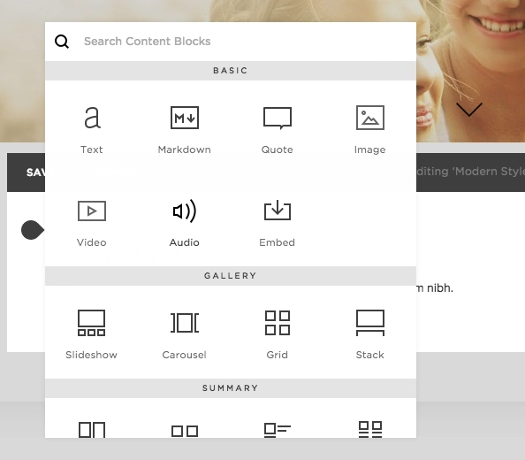
Below is a popup for the available content. There are tons of options — basic, gallery, summary, filters and lists, commerce, social blocks, and more.

I found a few more frustrating functions as I tried to edit more details of my pages: (1) the lack of an “undo” function while editing the page, and (2) the response time to changes in my design is very slow — sometimes the changes I’ve made don’t show up until a few minutes after I’ve saved, they look distorted, or Squarespace completely shuts down and all my changes are gone.
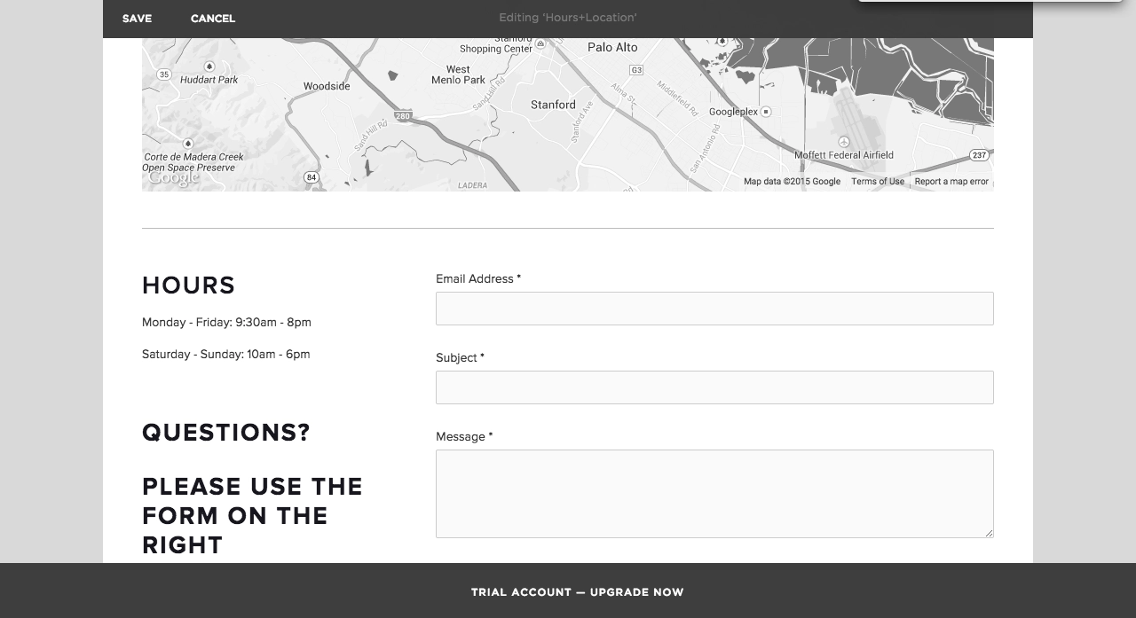
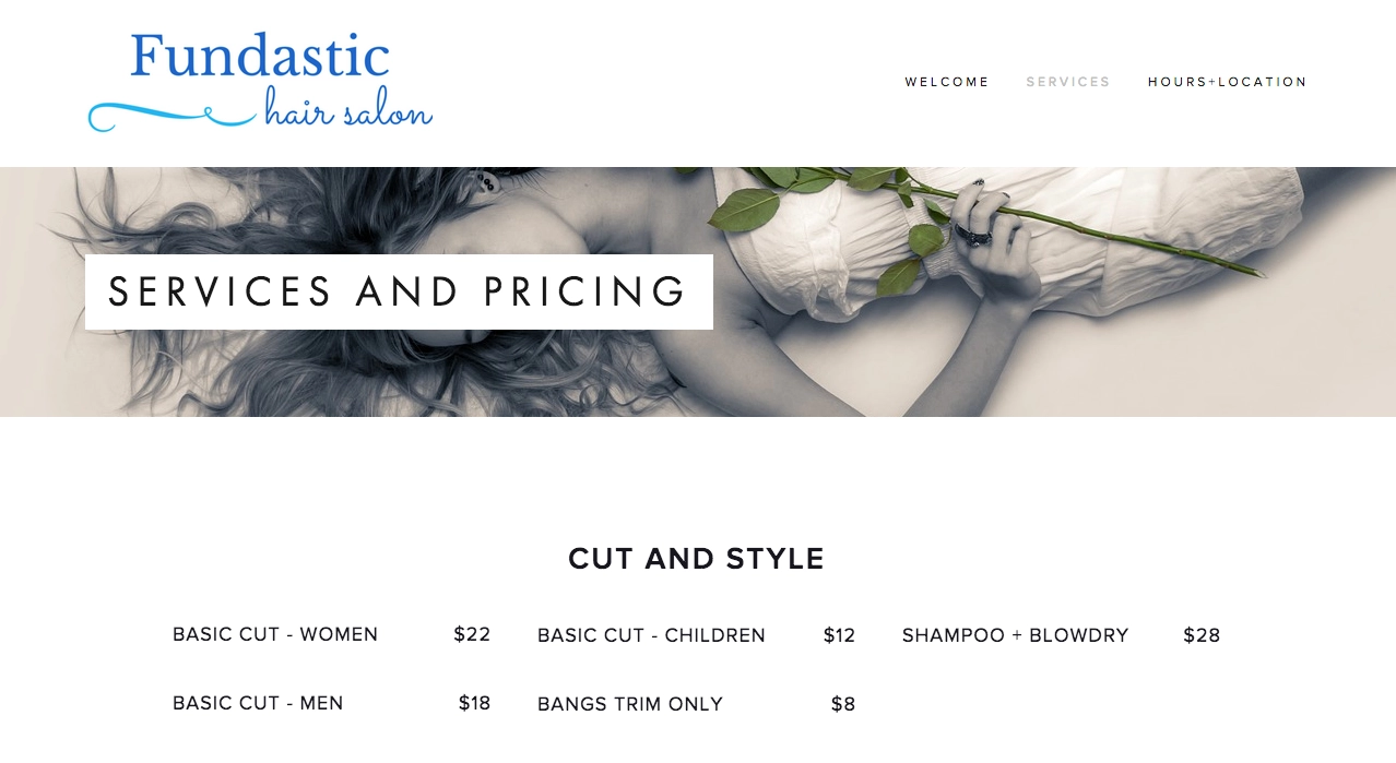
I edited my Services page by adding text content blocks to showcase my “menu” of services. On my Location and Hours page, I easily added a map of my business location and a contact form by clicking on the associated content blocks from the popup menu (see above).
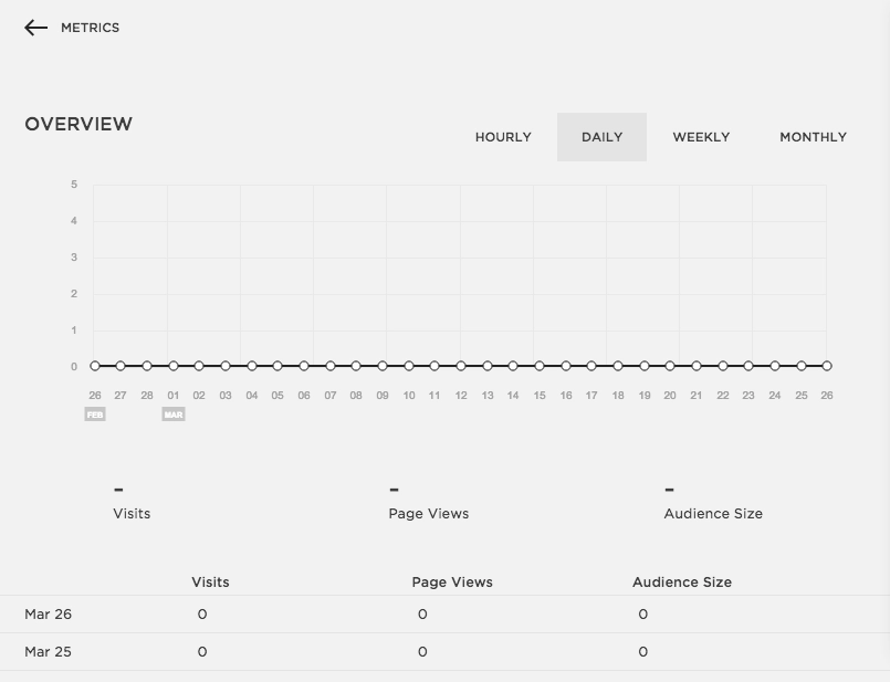
Squarespace also offers a beautiful website traffic metrics.
Adding e-commerce to a business website
To add e-commerce to my website, I clicked on “commerce” in the main menu. Squarespace walks you through 4 steps of creating commerce on your website. They also have a handy FAQ section in the commerce guidelines.
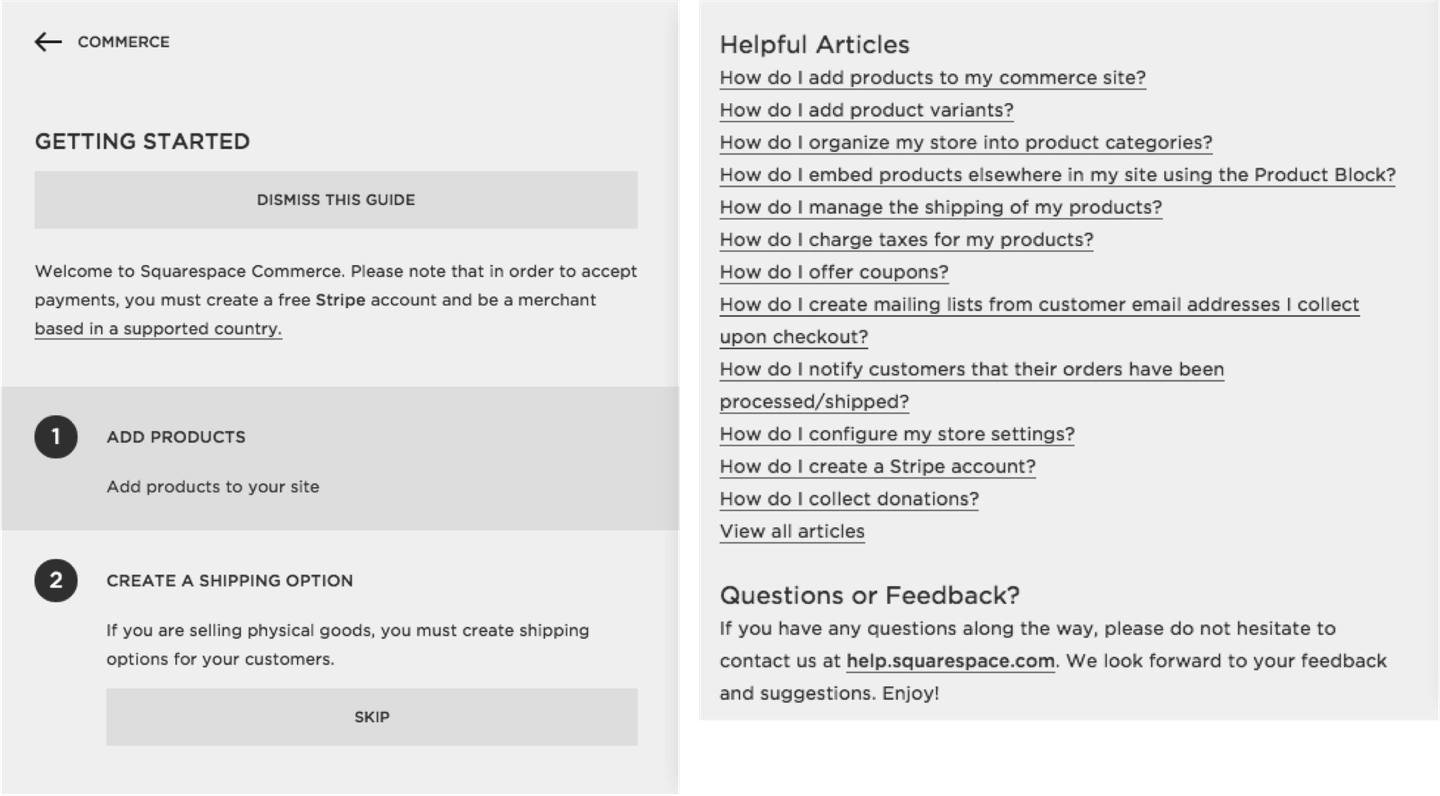
The first thing to do is add products. You can add digital products, physical products, or services. You can showcase your items as “on sale” or at market price.
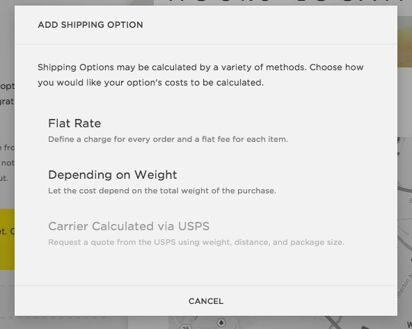
Next is to create a shipping option. Until you have a shipping option, you will not be able to showcase any physical goods. Below are the available shipping options.
Third is to connect your Stripe account. Stripe is completely integrated with Squarespace so you won’t have to deal with any popup windows from Stripe. Squarespace does not yet offer integration with any other payment systems (i.e., Paypal).
You can set up a Stripe account for free by clicking “Connect Stripe” and setting up a new account via the popup.
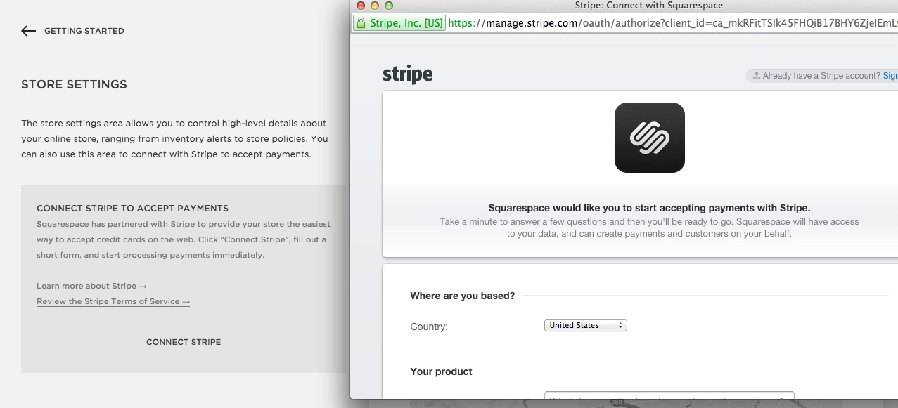
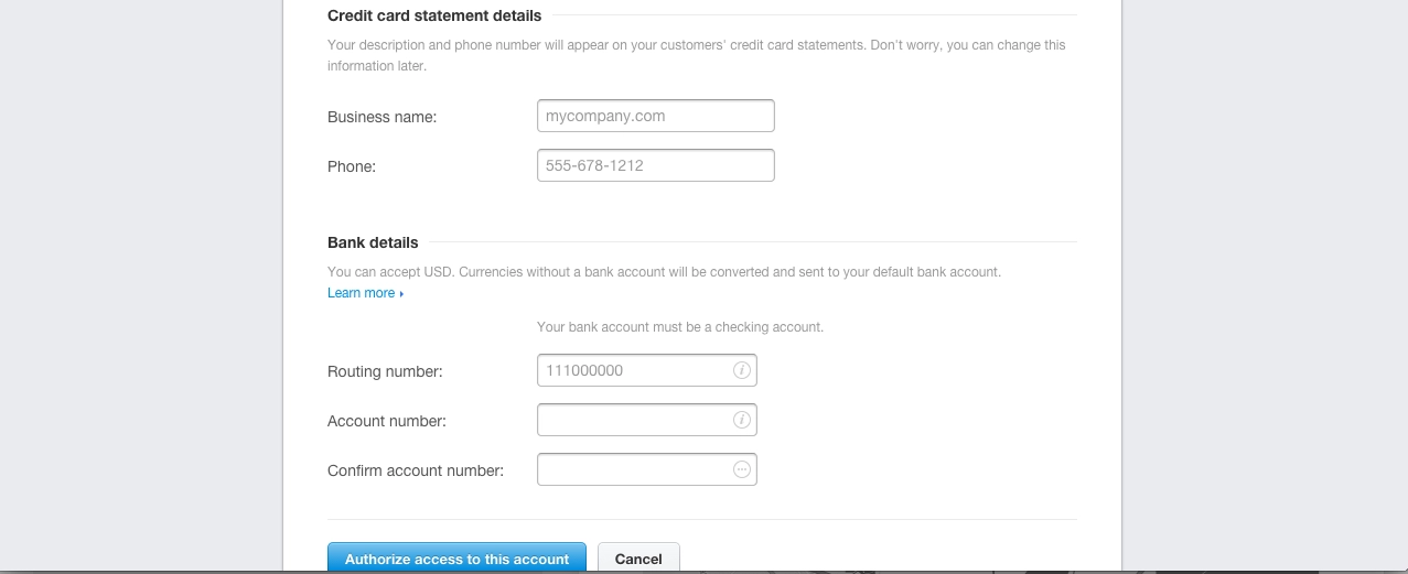
To integrate Stripe, you will need to fill out information about your business, the products you sell, personal details, and bank account details.
The last step is to flip the switch to launch the store. To launch your store, you will need to create a new page called a “products” page. You can find a step-by-step guide to setting up a Squarespace commerce page here.
Final product
How does my website look? Here are a few screenshots — although it’s hard to capture the design of the fixed background image!


The last word on website builders
In my experience, Squarespace’s templates really set you up to have a great looking website. By following the template design, I was able to create something beautiful in a short amount of time.
Squarespace is not as intuitive to use as Weebly, their pricing is more expensive for a basic and professional plan (however the business plan prices are almost the same), and they do not have a free option. Squarespace does offer more visually appealing design choices than Weebly, and they offer more options for advanced customization using HTML and CSS. Squarespace’s commerce system is easy to set up, as long as you don’t mind using Stripe to collect payments.
Overall, Squarespace is a great option for businesses looking for a beautiful way to express their business online. If you want to impress your website visitors without paying for a designer or spending excessive time on your webpage, Squarespace could be the perfect option for you!
Build your foundation with Nav Prime
Options for new businesses are often limited. The first years focus on building your profile and progressing.

Lydia Roth
Lydia is a former Content Manager for Nav, which provides business owners with simple tools to build business credit and access to lending options based on their credit scores and needs.
